 As a web designer, blogger, business owner, or website producer, you know the value of an updated, on-trend website. If it’s been a few years since you’ve updated your website or you’re looking to create something new, put these design trends front and center to beat trends for the coming year.
-
The “Hero” Message
Telling your customers exactly what you’re going to do and how it can benefit them is essential to any website. That’s called the “hero message” according to MARION, a full-service marketing agency, and it needs to be eye-catching, catchy, well-worded, and short while still encapsulating what your company does.
This can be tricky, but MARION recommends: “Think about what your company is most proud to provide to your customers and how you blow your competitors out of the water. Make sure you brainstorm with your team to come up with the perfect message. The right hero message will pop out from the other contenders.”
-
AI and Tech Integration
The backend design of your website is just as important as the front end. Many designers argue that it’s more important because it facilitates all the things you need to keep your website running without driving customers nuts.
Artificial intelligence and other innovative tech are elbowing their way into the everyday website. According to Jake McKenzie, the content manager at Auto Accessories Garage, the future of website design “likely includes contextual technology that combines the needs of a user’s environment with modern technology like VR in a seamless way that the user doesn’t even notice. Using AI in a smart way to make your site feel more human is going to be the key to success.”
Try using a chatbot on your website. At one time, this would have been a mistake, but modern chatbots are becoming more sophisticated and consumers rarely notice that they’re speaking with a chatbot instead of a human. If they do recognize it as a robot, they don’t mind if it gets the job done, and modern chatbots do get the job done.
-
Darker Backgrounds
It’s been a decade or so since web designers started claiming the amazing benefits of a white background. For years, we’ve only heard about how light backgrounds make it easier to read and don’t overwhelm the reader. It’s arguably the biggest component in minimalist design.
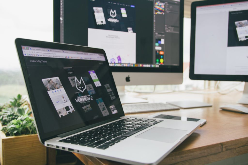
White backgrounds will still have a prominent place in 2020 design. However, we’ll start seeing more dark backgrounds. If done right, they can improve the overall impression for a consumer.
DarkDesign studio argues that it can be one of the best ways to make a dramatic presence. “Dark backgrounds make design elements stand out more, creating a higher contrast ratio with the use of other colors, but still improving visual ergonomics by reducing eye strain.”
Give it a try with your 2020 design. You might love it and carry this trend into fruition!
